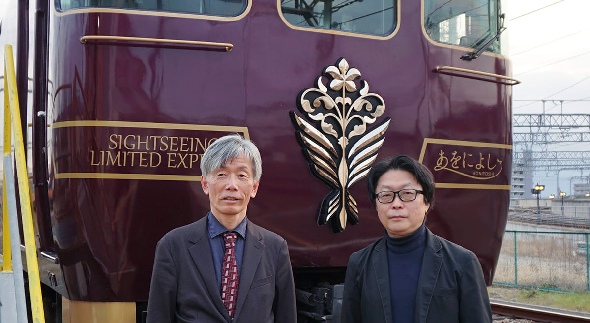
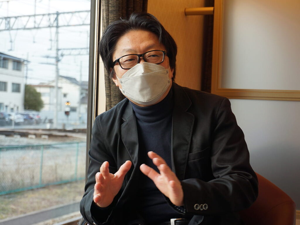
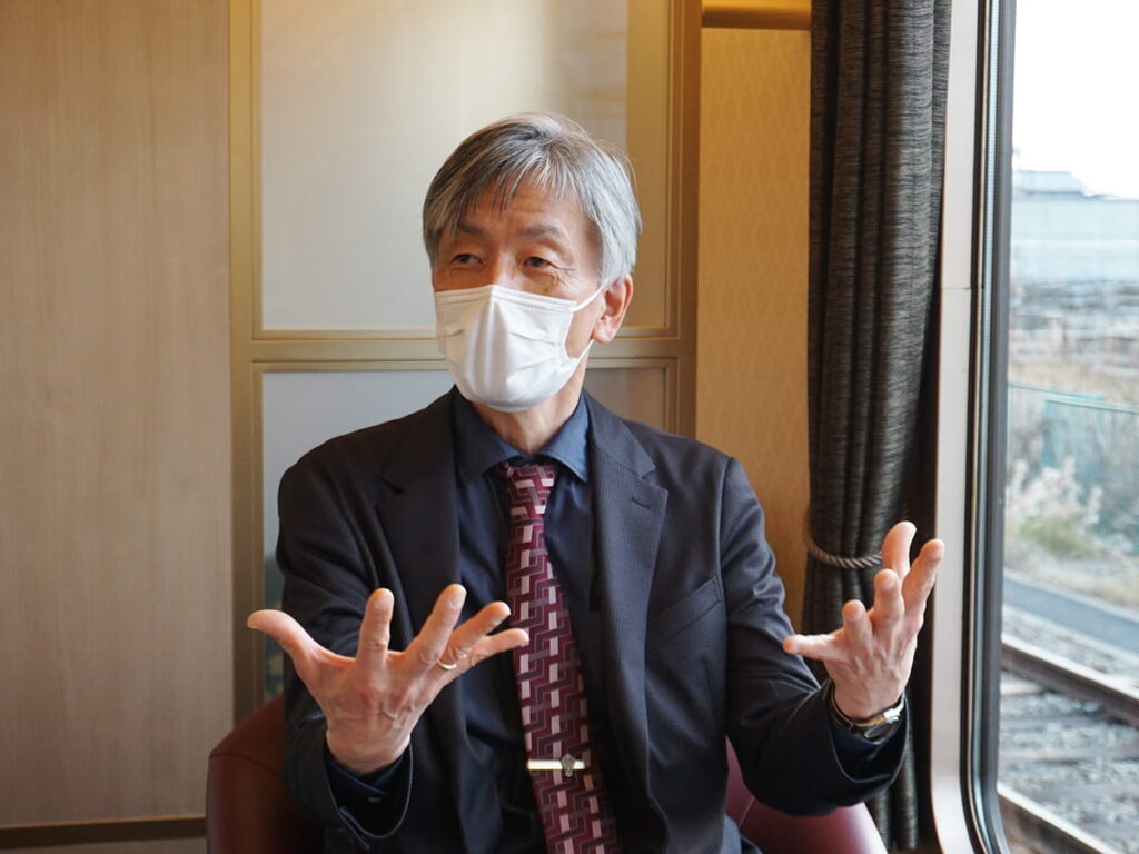
Left:Motoki Okuyama,Senior Manager,Planning and Coordination Department,Technical Management Division (train cars) Kintetsu Railway Co., Ltd. Railway Headquarters
Right:Junichi Kawanishi,Director and Designer,SIGNSPLAN Inc.
We invited Mr. Motoki Okuyama (Kintetsu Railway), who was in charge of the planning and development of the “AONIYOSHI” train, and Mr. Junichi Kawanishi (SIGNSPLAN), who designed the train’s emblem, to discuss the behind-the-scenes story of the emblem’s creation and the dedication to detail behind “AONIYOSHI.”
On the day of the interview, we were specially invited to the Higashi-Hanazono Depot in Higashi-Osaka to see the interior of the train.
◼︎The Planning and Development Process
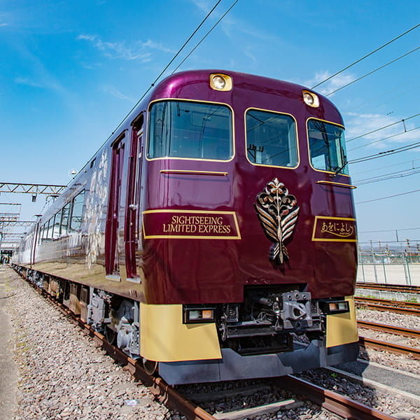
Okuyama : Kintetsu didn’t have a sightseeing train specifically for Nara, so we created the “Aoniyoshi.” Initially, our plan was to introduce a “Kyoto-Nara Sightseeing Limited Express” train that would connect Kyoto and Nara. About three years ago, before the COVID-19 pandemic, there were lots of foreign tourists. So we decided to operate a train from Osaka-Namba to accommodate inbound tourism, and created a limited sightseeing express train that would connect Namba, Nara, and Kyoto.
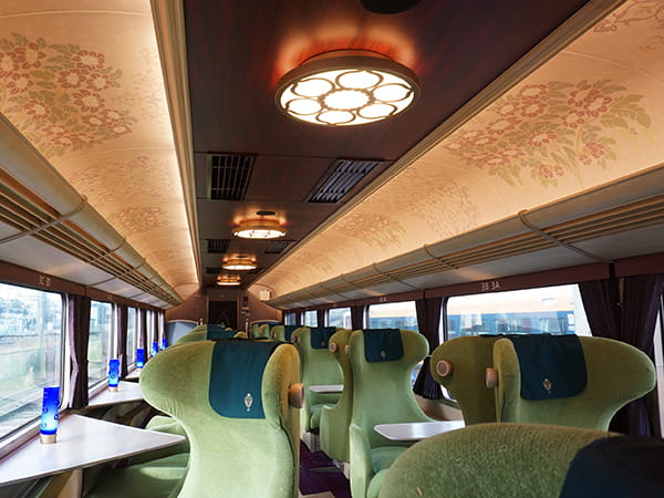
A Spacious Interior Consisting of 84 Seats
Indulge in an elegant and tranquil journey infused with history and culture,
featuring Tenpyō patterns inspired by the treasures of Shōsō-in.

◼︎The Train’s Concept
Okuyama : The concept is “A relaxing journey of history.”
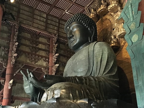
The train’s interior is adorned with Tenpyō patterns inspired by the treasures of Shōsō-in, allowing passengers to feel the history and culture of Nara from the moment they step aboard. It takes about an hour to get from Namba metro station to Kyoto Station, including a transfer. However, Aoniyoshi takes 1 hour and 20 minutes from Namba to Kyoto without any transfers. We decided to turn this extra travel time into an elegant and relaxing experience.
Immerse yourself in the romance of history on the leisurely journey through the three cities.
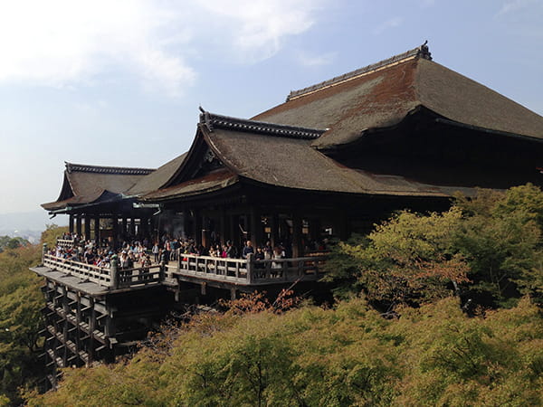
“AONIYOSHI” operates between the three prefectures of Osaka, Nara, and Kyoto.

◼︎The Story behind Requesting Mr. Kawanishi
Okuyama : We were introduced to Mr.Kawanishi through KINSO Co., Ltd., the company responsible for the train’s interior design. Normally, the company designs, plans, and constructs business establishments like department stores and hotels.
Kawanishi : We’ve been working together on various projects for about 20 years, and even after I started my own business, I continued to receive work from them.
When I received the request to design a train emblem, I was very surprised because no one’s ever designed a train emblem before, right? I ended up submitting around 10 design proposals, which is quite a lot.
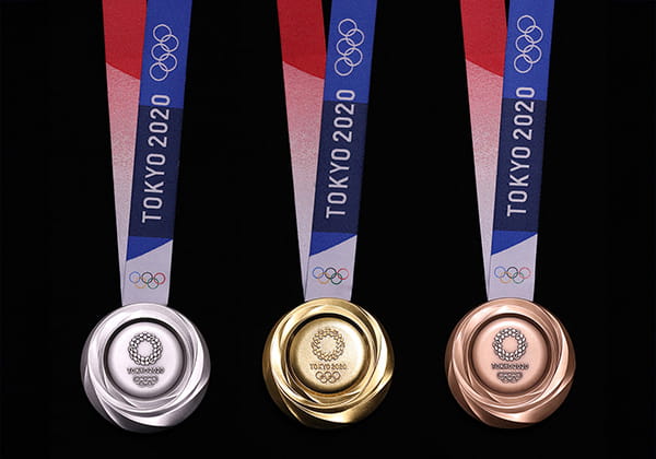
Okuyama : Speaking of designs, you also designed the Olympic medals.
Kawanishi : Yes, after my design was selected for the medals, I received this commission. I think the impression of the medals played a role, and they thought I could create an emblem with a three-dimensional effect similar to that. The fact that they specifically mentioned it makes me believe the medals must have left a strong impression.
◼︎Specific Requests
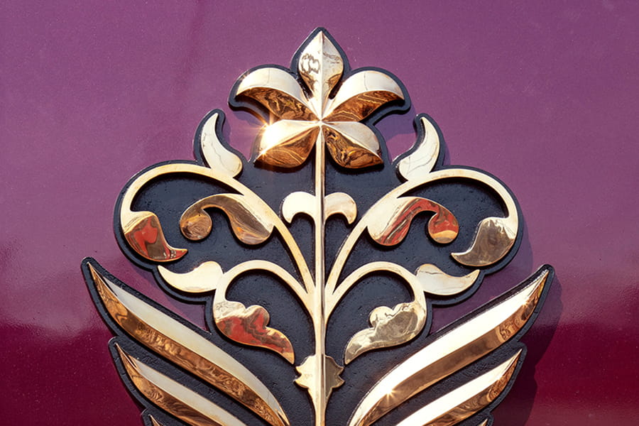
Kawanishi : Initially, KINSO’s request was “a Hanakuidori (Literally means a flower-eating bird. An auspicious patter of a bird carrying a flower in its beak.) bringing happiness.” Hanakuidori is an auspicious pattern originally from Europe.
The other motif was “a five-petaled flower,” often seen in the designs of the Shōsō-in treasures. They asked if I could create designs based on these two motifs. At first, I was working on separate designs for the Hanakuidori and the five-petaled flower. But while working on the emblem, I had the idea of combining them into a single design: a bird of happiness carrying a five-petaled flower.
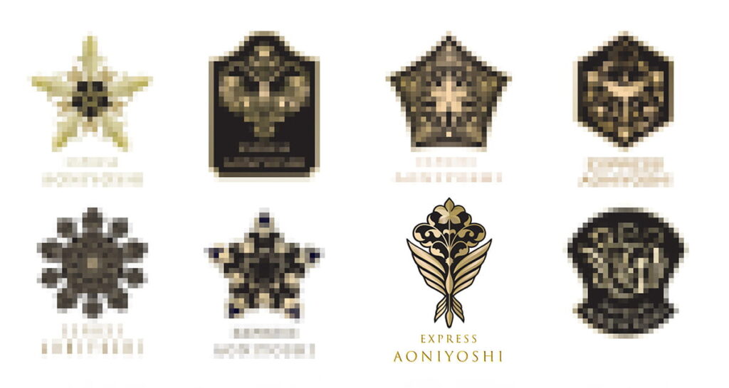
The final design that was chosen was inspired by a celebratory bouquet, giving it a festive feel.
Actually, out of the 10 proposals, that was my personal favorite.
◼︎Mindset towards Work
Kawanishi : I created 10 design proposals, but it was actually my own suggestion, and not requested by KINSO. I knew we would need at least 10 proposals to make something satisfactory. And even if my design wasn’t chosen, I felt a sense of satisfaction putting in the effort to create so many designs. Looking back now, it’s pretty crazy. I made so many of them!
I had also heard that Kintetsu was putting a lot of effort into this project. Before the COVID-19 pandemic, there were many foreign tourists, especially Chinese tourists, visiting Japan. But when they’d visit tourist spots, they would often use other railway lines.
Okuyama : They would travel around tourist spots using other railway lines, utilizing things like unlimited travel passes.
Kawanishi : With so many people already using existing train lines, it’s impressive that Kintetsu decided to create a completely new train. That’s Kintetsu for you! I believe their purpose and desire for this project, so was to showcase the magnificence of Japan to sightseeing tourists. Especially because the Kintetsu line passes through the most important route. Trains like the “Blue Symphony” have been made, but when I thought about the significance of doing it specifically in Nara, I felt a strong sense of determination.
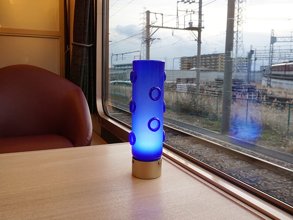
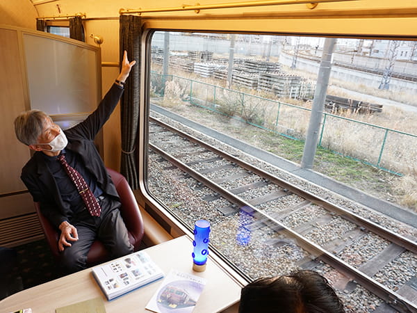
The size is 1.2m (height) × 2m (width).
The bottom edge of the window has been lowered to the limit, allowing passengers to fully enjoy the scenery.
◼︎Progress amidst COVID-19
Kawanishi : After submitting the design proposals, we didn’t hear anything for about six months due to the impact of the spread of the novel coronavirus. We submitted the design proposals and then there was complete silence. I was worried the refurbished train project itself might have been canceled.
Okuyama : We had aimed to attract foreign tourists to the train line as well, but due to Covid, the number of foreign tourists was suddenly zero. It became really tough for the company, too, but we had no intention of scrapping the project. There were some other plans that were scrapped, though.
But this project was treated as sacred. There were issues like delays in material delivery as well, which caused construction delays, but the project itself continued.
Kawanishi : My own work had also stopped and the design was left hanging. I wasn’t receiving any information, but everyone else was in the same situation. I felt on the verge of giving up. But one day, out of the blue, I got a message saying, “We’ve already narrowed it down to three options.” I thought, “Thank goodness. This project is still alive!”
Okuyama : We had various other issues, so the emblem had been placed on the backburner.
Kawanishi : I’m sure there were much more pressing matters. I think things like the interior design had already been decided before finalizing the emblem.
◼︎Key Reasons for Choosing the Design
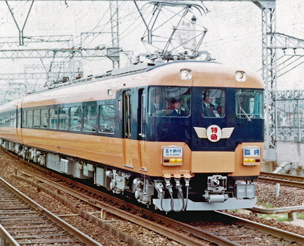
Okuyama : When we were deciding on the design, we had a few candidates, but this one caught my eye right away. Interestingly, the 12200 series limited express train “New Snack Car,” which became the base for Aoniyoshi, also had a wing-like emblem similar to the one we chose. I’m extremely happy we chose a design that captures that essence.
In the midst of the dark atmosphere of the spread of novel coronavirus and the war in Ukraine, I hoped the Hanakuidori would bring happiness. In a way, I hoped this train would become a bearer of happiness. I believe our vision, and the sentiments poured into the emblem by Mr. Kawanishi–that sense of celebration–came together really nicely.
Kawanishi : During the pandemic, the atmosphere was really dark. Nobody was going out, and there was a lot of anxiety about what would happen. So I also wanted to somehow break through all of that with this design.
◼︎Design Considerations
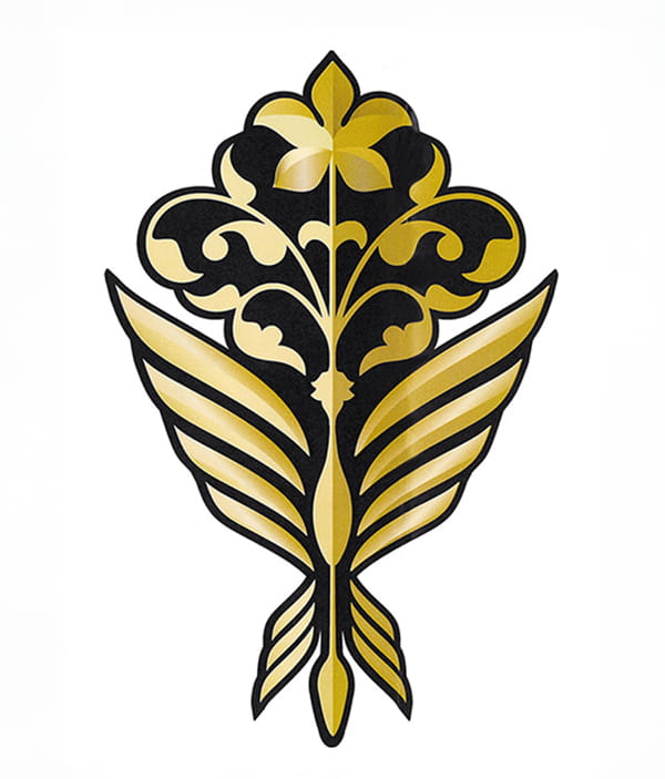
Kawanishi : At first, I was trying to create the shape of a phoenix.
The phoenix has a strong image and the theme was “bringing happiness,” so I wanted it to spread its wings and soar. But if I spread them too wide, it would end up resembling the emblem of the old express train that became the base for Aoniyoshi. So I consciously avoided spreading horizontally, and instead aimed for an upward, ray-like movement.
Also, funnily enough, this emblem is actually in the golden ratio. When I connected the dots after completing it, it coincidentally turned out to be in the golden ratio. Symmetry had been requested from the beginning. Since it’s an emblem for a train, it needed to maintain a consistent shape from the center. So, I kept that in mind.
◼︎The Challenges
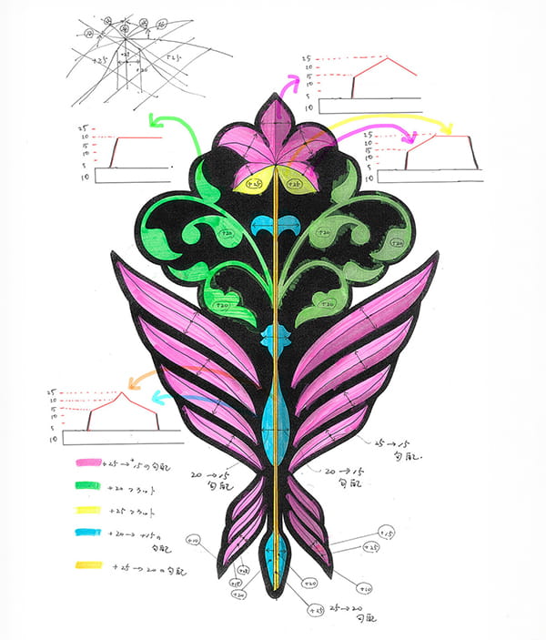
Kawanishi : Turning the design into a 3D model was tough. We couldn’t tell how the emblem as a 3D design would look when lit up because this couldn’t be seen from a flat diagram. So we created a concept drawing. All I could do was visualize things in my head like: “If the light isn’t hitting here, maybe this part will light up instead?” I drew some cross-sections and discussed it with Mr.Okuyama, and he brought it to life.
He made precise adjustments to the angles, and it turned out exactly how I had envisioned it. It was amazing! That was a challenging part of the process, but also really rewarding.
◼︎Design Precision
Kawanishi : We really focused on achieving the right balance, from the shapes of the flower to the spacing between each of the parts.
When we were commissioned for the design, they mentioned the need for a base. If we had made it exactly like the design drawing, all the parts would have been all over the place. So we created a base and placed the parts on top of that. We adjusted the positions of the parts to the millimeter, but the edges kept sticking together or moving apart. On top of that, with each small adjustment, the shape would change. Those little adjustments took up so much time, more than anything else!
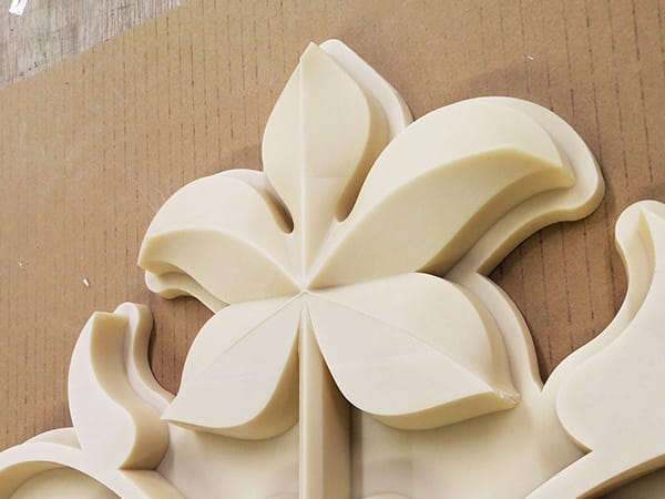
The balance between the flower and the border outlining the base is exquisite.
◼︎Perfecting the Emblem Design
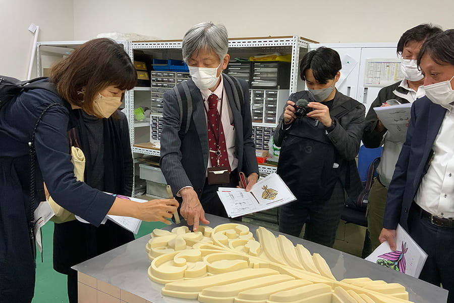
Kawanishi : When we were turning the design into a 3D model, I created the concept drawing with my own specifications like, “this part should be mountain-shaped” or “I want this part to shine.” And Mr. Okuyama then brilliantly materialized that vision.
Okuyama : For the pink and blue parts and the five-petaled flower, we had specific angle instructions. But for the green part, there were no instructions. So I asked him to add subtle gradients to certain parts of the drawing so it would look three-dimensional.
Kawanishi : It turned out really beautifully with the central parts of the five-petaled flower rising up sharply, like mountain peaks.
Okuyama : I took the liberty of making some adjustments myself. I had a hard time imagining the final design from just the drawings. But when I went to inspect the prototype for casting, I finally got a clear image in my mind, so we asked the factory to make various adjustments.
◼︎Reasons for Choosing Daikan
Kawanishi : Before we approached Daikan, someone from KINSO saw the design illustration and asked, “Where can we get this made?” I casually replied, “There’s no one but Daikan, right?” We had previously commissioned a job from Daikan, and the quality of the finished product was extremely excellent. So I said, “If it’s Daikan, I’m sure they can do it.”
Okuyama : Neither us at Kintetsu nor KINSO knew what company to approach for making an emblem. So we talked to our subsidiary company, AD KINTETSU Co., Ltd., which mainly handles advertising-related work. And that’s how we heard about Daikan. It just happened to be the same name that Mr. Kawanishi had mentioned, so we went ahead and requested Daikan through AD KINTETSU.
Kintetsu Railway Co., Ltd., KINSO Co., Ltd., and AD KINTETSU Co., Ltd.
◼︎The Distinctiveness of the Metal Sculpture
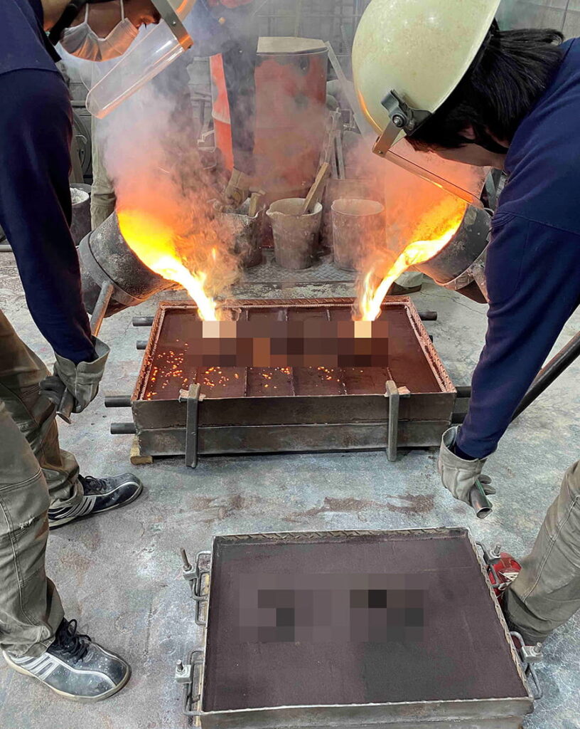
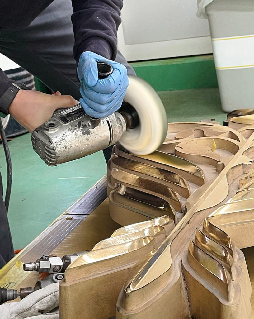
Okuyama : The distinctiveness of the sculpture lies more in the choice of materials rather than in the angles. We opted for gunmetal. There are various materials available, made from other metals or resin. Painting over resin is also an option. However, we specifically chose gunmetal for its dignified look. It’s not something artificial or fake like plating; it’s the genuine brilliance of gunmetal itself that makes the sculpture stand out.
As for the shape, Mr. Kawanishi took care of that, and our challenge was how to present it beautifully. As it’s made of gunmetal, it will weather over time, but honestly, I’m actually looking forward to seeing how it’ll look with that weathered appearance.
◼︎Impressions during Inspection
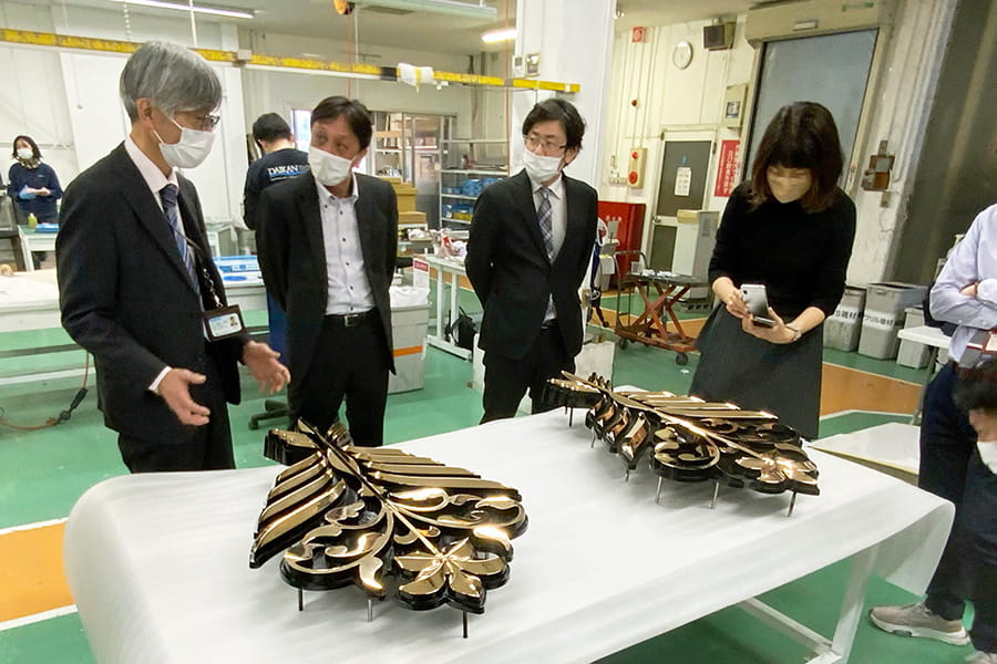
Okuyama : When I went to the factory for the final inspection and saw the finished emblem, I was deeply moved. It was shining so brightly. I was so glad we went with gunmetal. That was such a touching moment. Truly. It sparkled and shined so brilliantly!
Kawanishi : It just naturally picks up light from everywhere and shines.
Okuyama : It’s not every day that a product moves you like that.
DAIKAN : I’m glad. All that polishing was worth it.
◼︎Impressions after Installation
Okuyama : When they finally attached that emblem, which had been shining beautifully at the factory, I was over the moon.
Kawanishi : The base of the emblem is also rounded to match the shape of the train’s body.
Okuyama : Aoniyoshi’s face is not flat but has upward and downward curves. To accommodate this, we needed to apply 3D processing to both the surface and the back of the cast metal, so we got the angles skillfully adjusted.
Kawanishi : That’s amazing. I’m sure you must have faced a lot of challenges while dealing with those subtle, intricate aspects. Creating it must have been really difficult, right?
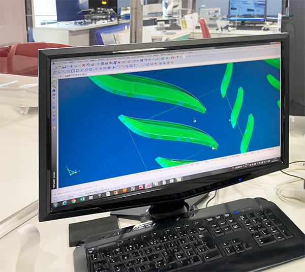
DAIKAN : No, it was fun, actually. Based on the concept drawing we received, we drew cross-sectional diagrams with varying contours for each part. It was taking shape in my mind, but seeing what I imagined actually coming to life was a really cool experience.
Kawanishi : I think it was definitely more difficult for the creators like you to bring those thoughts into reality than for designers like us. Sometimes I just leave everything to the manufacturers, so I’m really thankful, and it’s amazing how difficult it is to materialize something.
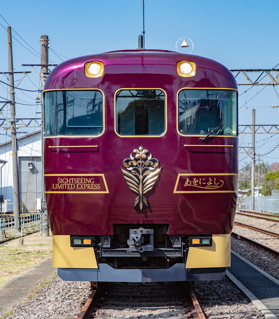
◼︎Rating the Emblem
Okuyama : I’d definitely give it a score of 100 points or more.
Kawanishi : Same here.
Okuyama : If we could only give it a max score of 100 points, it would be 100 points. If it were 150 points, then 150 points.
Kawanishi : There’s no question about it.
Okuyama : It would’ve been great if it had been a little less expensive, though.
DAIKAN : I’m sorry, but the cost of metals went up.
Kawanishi : It’s okay. The work done by Daikan is worth it.
DAIKAN : Thank you.
Okuyama : At first, I was surprised and thought, “Does manufacturing an emblem cost that much?” But once the product was made and installed on the train, no one would complain. It was simply that amazing.
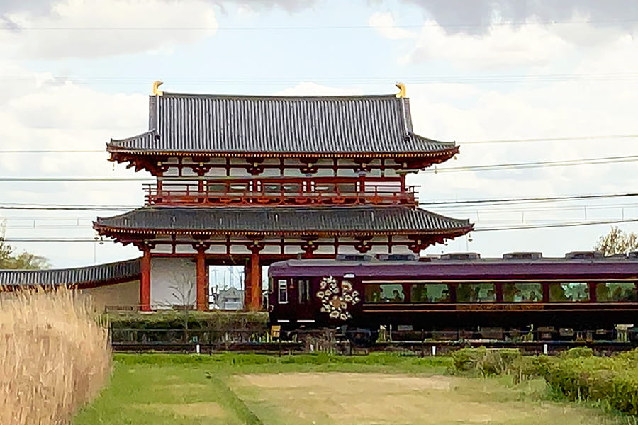
◼︎The Charm of AONIYOSHI,and Looking Ahead…
Kawanishi : Of course, the interior is nice, but for me, it’s the metallic look of the exterior that really stands out.
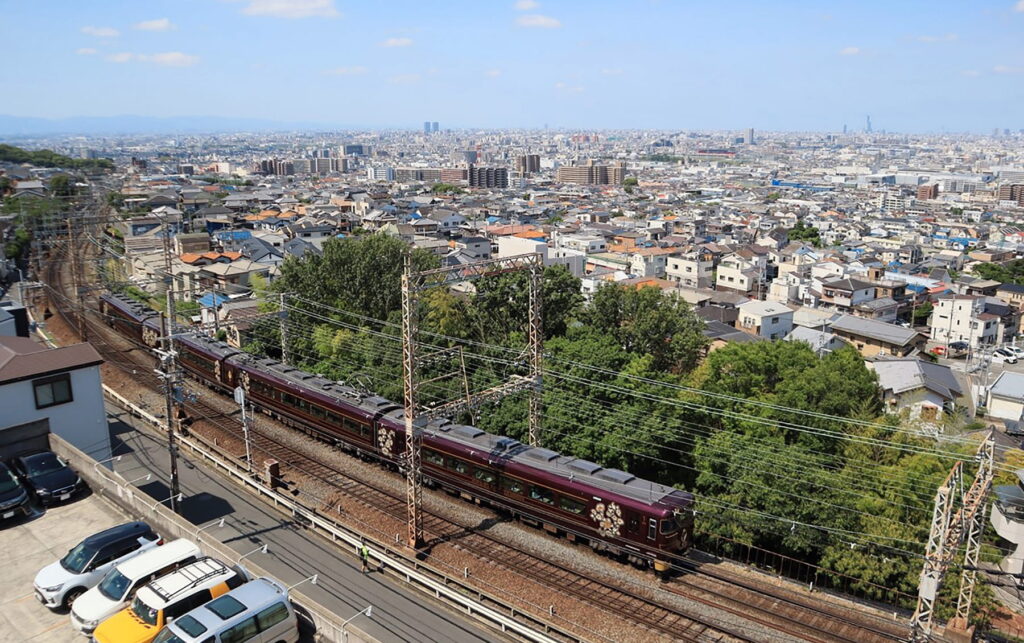
When it passes by the Heijo Palace Site, the harmony with the greenery is wonderful. It perfectly captures the feeling of the ancient Nara period while still looking modern. It possesses a certain elegance, reminiscent of he stylish people of old Nara, as if it were gracefully passing through, adorned in the attire of a noblewoman. The way the train blends into the scenery is just perfect. That’s what I find charming.
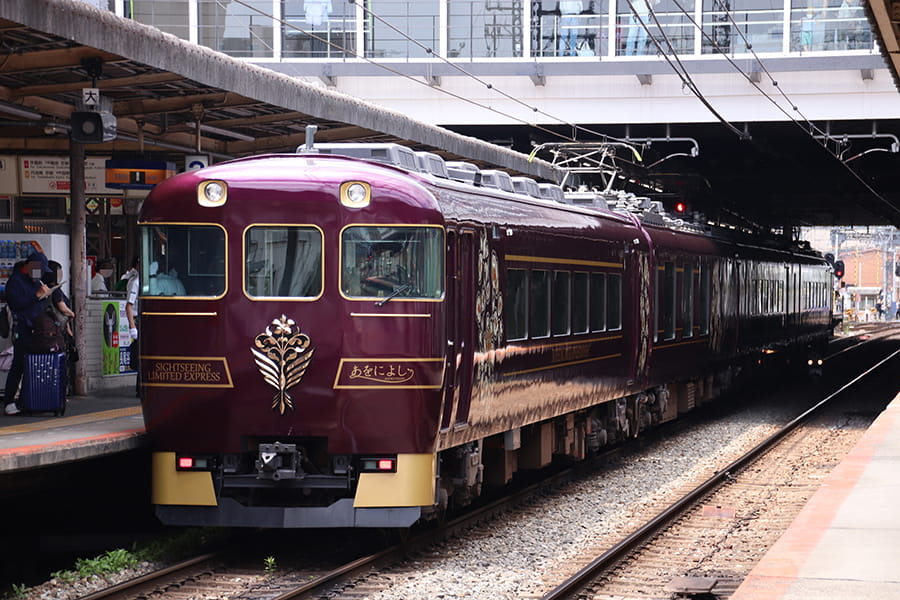
Okuyama : Definitely the train’s exterior. When it pulls up to the station platform, your eyes are immediately drawn to that shiny emblem. And the purple train body. Once you board the train, you can really feel the essence of Nara. That’s the charm of this train.
The only sad thing is that the ride is short. At most, it’s only 1 hour and 20 minutes, so I hope people ride it multiple times. This is Kintetsu’s second fully-fledged tourist train, following the “Blue Symphony,” which also features renovated train cars. We hope to continue receiving your valued patronage in the future.
Okuyama : Actually, after it was completed, I rode the train as a regular passenger. It was extremely heartwarming to see the other passengers’ joyful faces. I’m really happy we made it. That experience was the ultimate reward.

